When you plan to build or upgrade your website, one of the biggest confusions will be choosing between Responsive or Adaptive Web Design. Many people mix up these two terms, but they are different even if they look similar. If you run a business and want your website to perform well across all devices, understanding this difference is important.
If you're considering building a new website, you can also explore expert guidance from a Website Development Company in Chennai to choose the right approach.
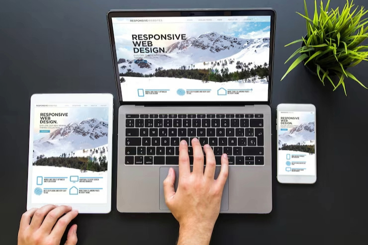
What is Responsive Web Design?
Responsive Website Design means your site automatically adjusts to any screen—mobile, laptop, desktop, or even large monitors. It works like water filling any container — it changes shape to fit perfectly.
This approach uses flexible grids and CSS media queries. The same code is used everywhere, but the layout expands, contracts, or rearranges depending on screen size.
For example, a three-column desktop layout may turn into a single-column layout on a mobile device.
If you need help implementing this approach, a professional Web Design Company in Chennai can assist.
What is Adaptive Web Design?
Adaptive design works differently. It detects your device size and loads a layout built specifically for that screen. Think of it like a custom-tailored outfit—different versions for different body types.
You might have separate layouts for mobile, tablet, and desktop. The website displays whichever version fits best.
For businesses with complex UI/UX needs, consulting a Web Development Company in Chennai can help you design device-specific layouts.

Benefits of Responsive Web Design
- Cost-Effective: Only one website to build and maintain.
- Easy Maintenance: Single codebase means updates are simple.
- SEO-Friendly: Google prefers responsive layouts because they’re easy to crawl.
- Future-Proof: New devices don’t require new layouts.
This is the most recommended approach by many Web Design Services in Chennai.
Benefits of Adaptive Web Design
- Better Performance: Faster loading by delivering device-specific layouts.
- Highly Optimized: You decide what content loads on which device.
- Perfect for Old Sites: Helpful for adding mobile versions to existing desktop sites.
Which One Should You Choose?
Choose Responsive Web Design if:
- You want one website for all devices
- You prefer lower costs
- You want simple long-term updates
- You want stronger SEO performance
Choose Adaptive Web Design if:
- You need full control over each device layout
- You already have an existing desktop site
- Your mobile and desktop users behave differently
If you're unsure, a specialist Website Design Company in Chennai can analyse your user behaviour and guide you.
Why Web Design Services Matter
Choosing between responsive and adaptive design isn’t only technical — it influences business growth. A well-designed website keeps visitors engaged, builds trust, and improves conversions.
Working with expert Web Design Services Chennai ensures your website matches your audience’s needs and performs smoothly on all devices.
Common Myths to Clear Up
Myth: Responsive is always better
Truth: Responsive works for most businesses, but adaptive can suit
high-performance needs.
Myth: Adaptive is too expensive
Truth: It can cost more, but performance gains often justify it.
Myth: Google only prefers responsive
Truth: Google only cares that your site is mobile-friendly — both designs work.
Conclusion: Make an Informed Choice
The choice between Responsive vs Adaptive Web Design depends on your goals, audience, and budget. Responsive provides flexibility and future-proofing, while adaptive delivers maximum control and performance.
To ensure a professional outcome, partnering with a skilled Web Development Company in Chennai will help you build a site that looks stunning and boosts your business growth.